SuperHi
→ Website
Year: 2016
Role: UX/UI Designer Contract
Team: Co-Founder/Chief Technical Officer, Front End developer
SuperHi is an online coding school that teaches people how to design and create websites. The lessons are taught via video and using SuperHi’s own code editor. This case study shows the process of how I improved the interface of the code editor and designed features that made it a tool that aids and encourages autonomous learning.
When I started working on SuperHi I was attending the classes myself. That way I could work closely with Rik Lomas, the founder, brain and developer of SuperHi as well as other students. Attending the lessons myself gave me in-depth insight into the struggles of someone who is new to learning how to code and also allowed me to observe what other students on the course were struggling with. At the time the code editor was still in closed beta and my job was to get it ready for launch in early 2016.
Discovery Stage
Competitor analysis
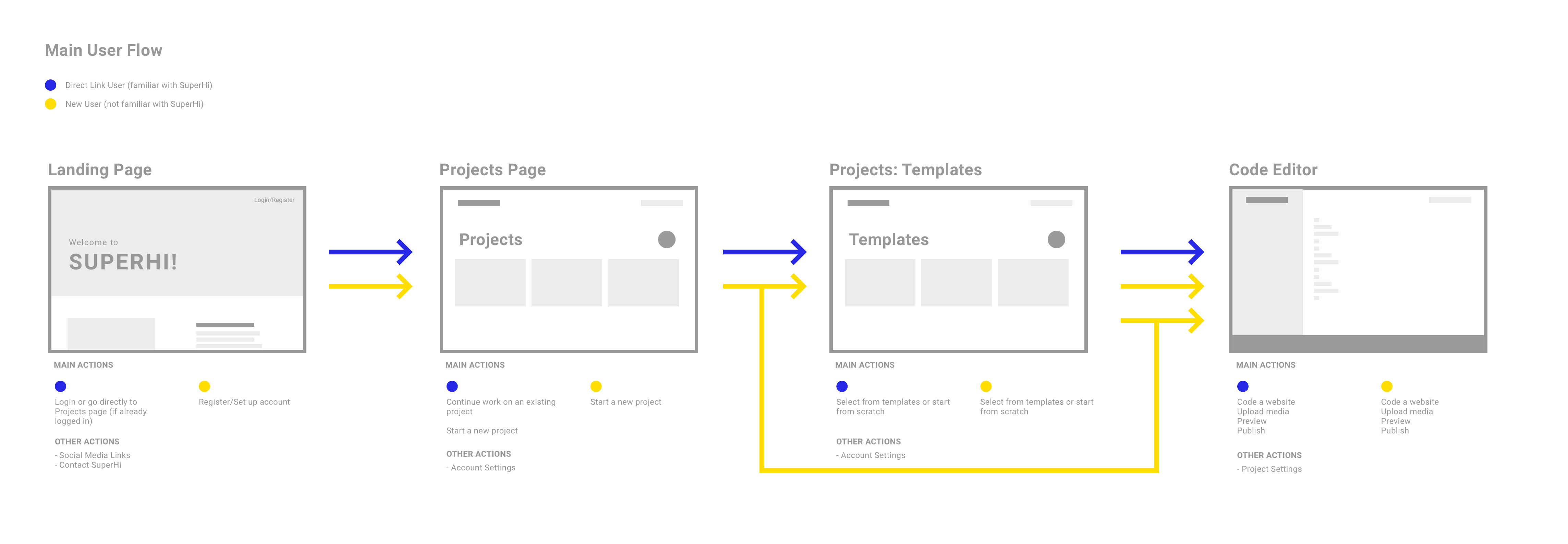
We looked at plenty of other direct competitors. From Atom, a well known code editor to Macaw, a web app that translates website designs directly into code. We tried, tested and analysed their features, interfaces and how they onboarded new users. The advantage of SuperHi was that you only had access to the code editor when you were a student. That meant that we could skip a complicated and lengthy onboarding process and could focus on the features that encouraged autonomous learning and support when students were writing code outside of the classes.
Knowing our users
In order to attend the coding classes every student had to apply online and provide both a basic profile as well as their motivations why they want to learn how to code their own websites. This gave us a great understanding of our personas and their goals. To stay in touch with the students we used a Slack channel. This proved to be the best way to provide support, respond to feature requests or introduce and test new features.
Define Stage
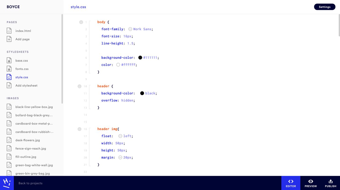
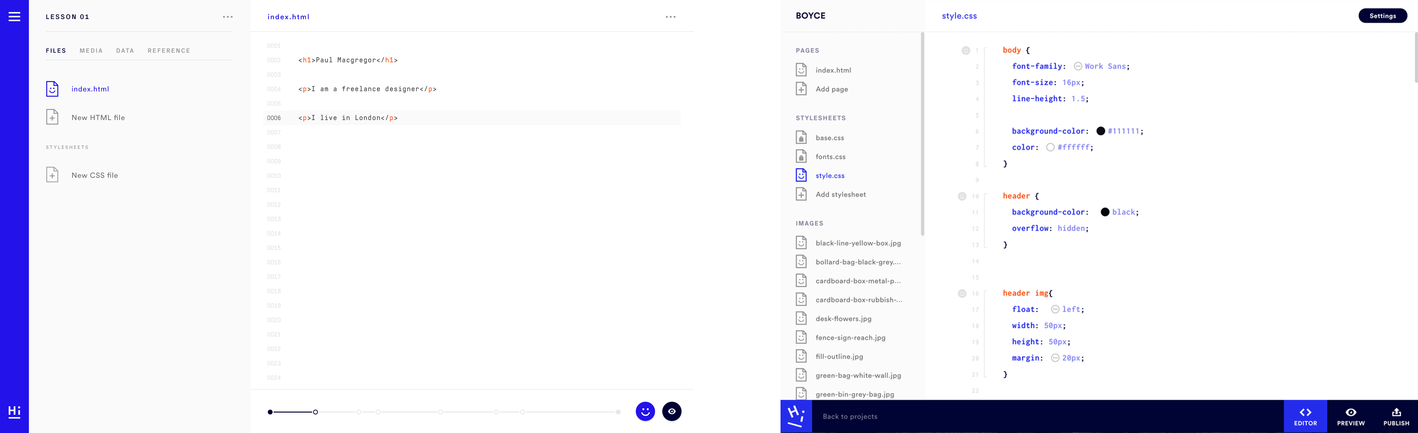
Restructuring the layout
The initial layout of the code editor interface consisted of a sidebar, a side menu and the code editor itself. The sidebar was located on the lefthand side (see image below) and contained only a hamburger menu. An unnecessary extra layer as two of the pages located in the hamburger were frequently used: Projects and Settings. Next to the sidebar was the side menu that gave an overview of the information architecture of the website the users were coding. The majority of the space was dedicated to the code editor itself and two floating buttons that allowed to toggle between editor and preview mode. Based on the feedback we got from students we decided to get rid of the hamburger menu and move the main navigation from the left of the screen to the bottom. The settings moved from the hamburger menu in the right top corner of the header and the two toggle buttons found a new home in the bottom navigation bar.
↘︎ Before & after the redesign
Minimising beginner mistakes
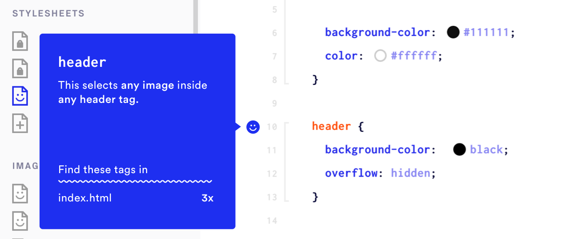
One of the most common mistakes people make when they learn how to code is that they forget to close their tags. This can be very frustrating as this means that they have to review the whole code in order to locate the missing closing tag. We therefore decided to subtly mark tags that haven't been closed with brackets indicating where the tag starts and where it ends.
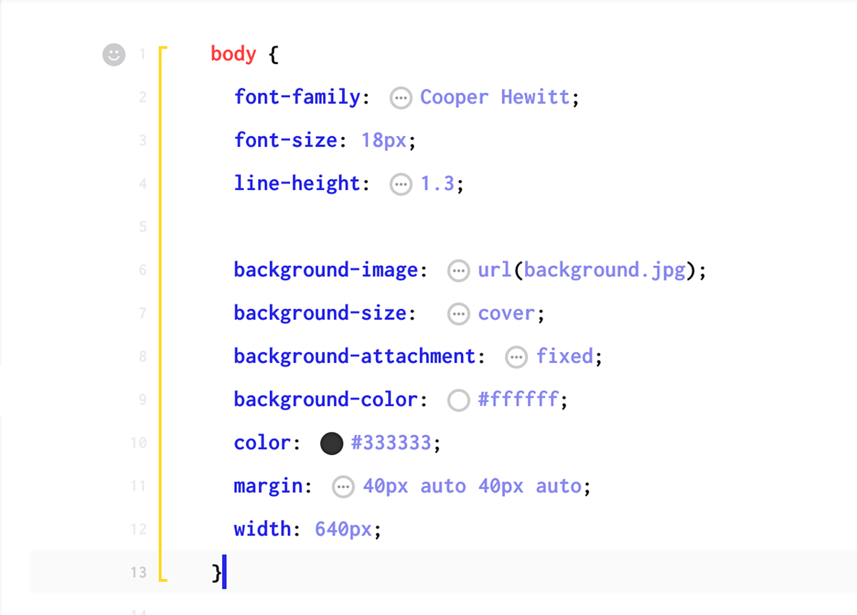
↘︎ The bracket on the left indicates the beginning and the end of the tag
Help users help themselves
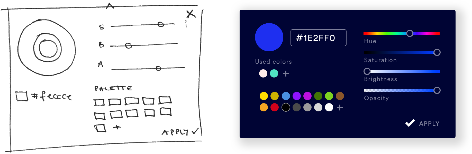
We introduced 'little helper' pop ups to add an informational layer to the code editor that explains the purpose and functionality of certain tags. Some of them would also remove the need to write the code yourself. For example the colour picker pop up let's users select the colour directly rather than copy pasting the hex code of the colour into their code.
Design Stage
Branding requirements
The branding guidelines have been established by Studio Koto. The vibrant colours and chunky iconography give SuperHi a friendly and approachable look and feel whilst keeping the balance between a playful design and a clean and organised interface. Code editors usually look like the control panel of a spaceship (which is cool, but also quite daunting if you're new to coding). We wanted SuperHi to give the impression that coding is simple and that there is always help and support when students need it.
With this in mind I decided to give the main navigation a dark blue colour (which was also easier on the eye than the bright royal blue) and used red, yellow and royal blue to accentuate and highlight features or helpful info in the code editor. As these are especially important in a learning environment like SuperHi, where students need to be able to see quickly where they have made a mistake and how they can correct it.
Delightful interactions
Microinteractions are a good way to give an interface more personality and create delightful moments for users. SuperHi's 'wiggly line' is one of these microinteractions. It is shown instead of the default loading wheel and is also incorporated in the layout of the pop ups/tooltips. The blue smiley face icon became the 'little helper' within the code editor.
Iteration Stage
Features we thought we needed
A good example of a feature that we assumed students needed was the ability to add notes directly into the code editor. We could see that some students had a hard time keeping up with the pace of the lessons because they were to busy writing both notes in their notepads as well as the code in the editor. We therefore assumed by adding a ‘notes’ feature directly into the code editor we could solve this problem. Speaking to students we found out that this feature is not needed. It would clutter the clean interface of the editor and in this case students preferred to take notes in a notepad, rather than having to go into a specific project on SuperHi and searching for the notes there.
And how about an iPad app?
We were debating the need for an iPad app due to the launch of the new Apple device in late 2015 and an increased hype thereafter. But the fact that most of the educational features like the pop ups and tag brackets work on hover only would have made the development of an iPad app incredibly unsustainable.
Summary
SuperHi has officially launched in May 2016 and is still growing. It was an exciting project to work on and we have achieved a lot in this very short amount of time.
In hindsight I think we could have sped up the workflow by prioritising the features and checking in with users more regularly. This way we could have avoided spending too much time thinking about an iPad app or a note taking feature.
The launch of SuperHi has been received extremely well and has gained a big following of successful students and alumni.
Selected Projects

FerlyUX/UI Design, Design Research, Branding, Illustration
Moody MonthUX Design, Design Research, UX Strategy
CoconutUX/UI Design, User Research, Illustration
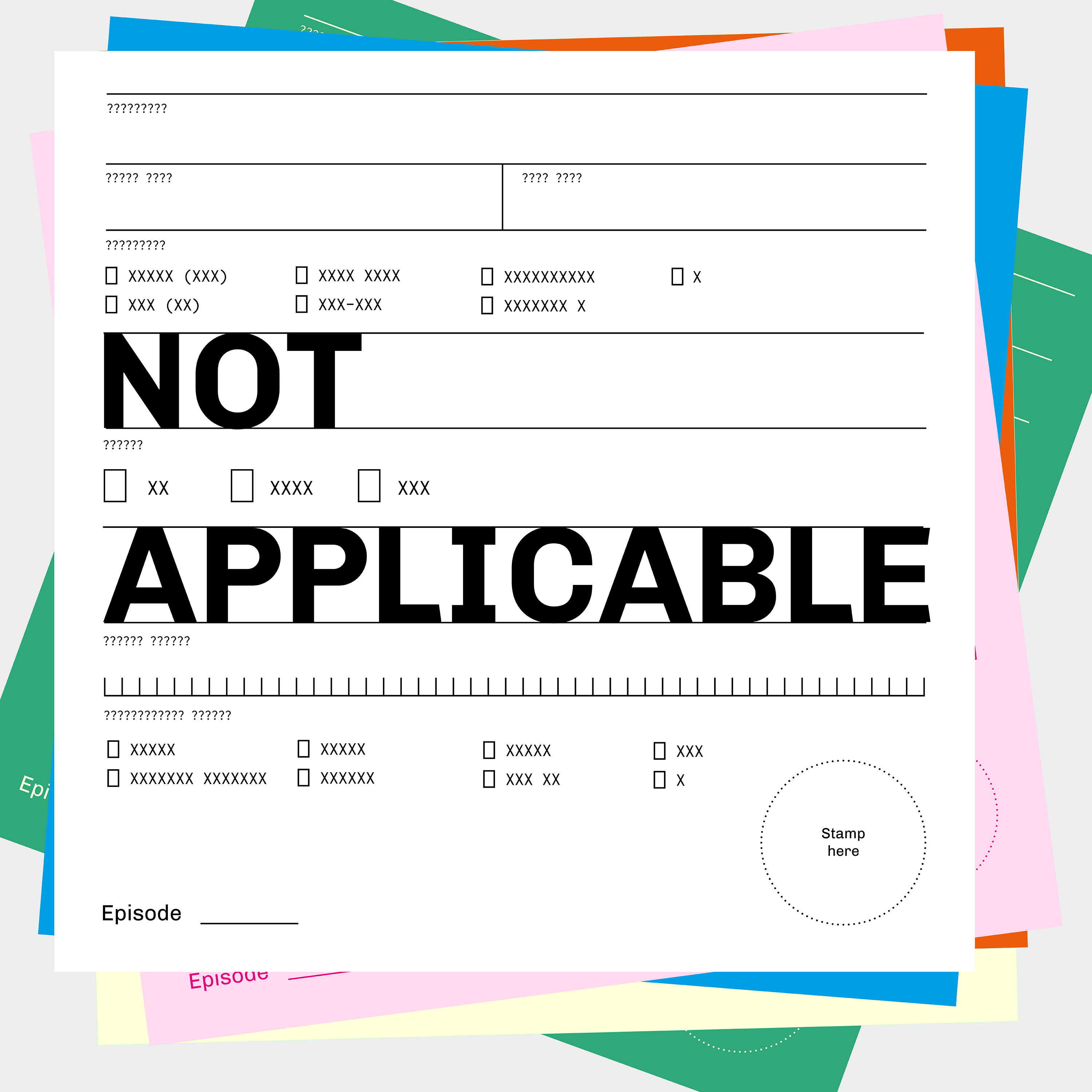
Not ApplicablePodcast

I AgreePoster Design, Information Graphic
SuperHiUX/UI Design
Schwarze Hunde & Bunte SchafeEditorial Design, Book Design, Storytelling, Writing