Ferly
→ Website
Year: 2019
Role: Lead Product Designer & Researcher
Team: Chief Science Officer, Chief Technical Officer
Awards & Recognition:
App of the Day 6th March 2020
→ Listen to an interview about my work on this project with Hannah Phang
Ferly is a sexual well-being company for women. Ferly’s co-founders Anna Hushlak and Billie Quinlan have made it their mission to give all women the knowledge, tools and techniques for a healthy, confident and pleasurable sex life. The Ferly mobile App offers a space to learn guided practices for body and mind, explore contemporary sex ed and dive into sensual stories – all in a bite sized audio format.
I joined Ferly as the Lead Product Designer in November 2018 to design the very first audio guide to mindful sex. I was responsible for designing the entire user experience and taking the product from concept stage through to a successful App Store launch in June 2019, which resulted in a successful round of investment shortly after.
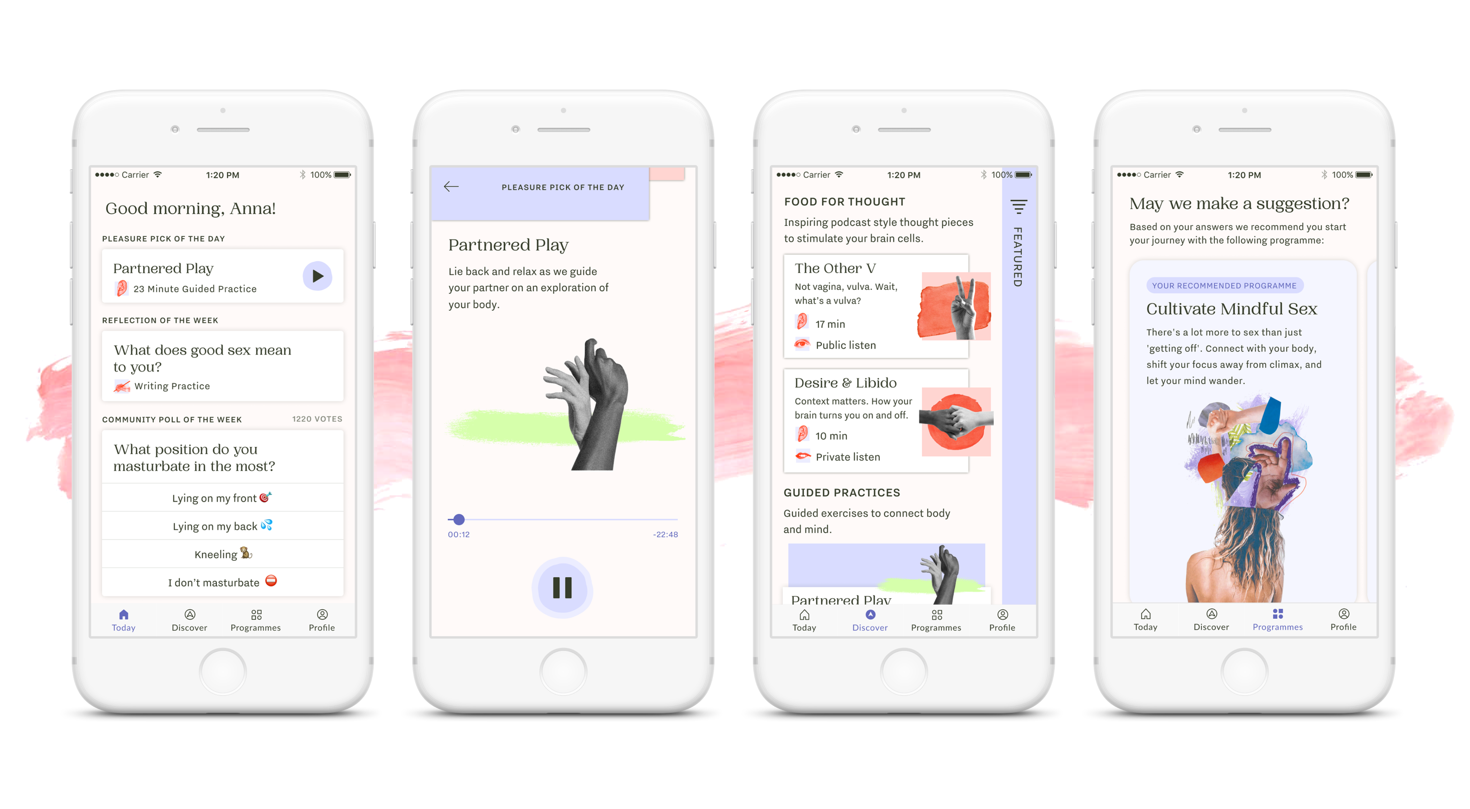
The Alpha Stage
~ 3 months
When I started working at Ferly the App was still in idea stage. The concept of a sexual well-being App was entirely new and there were hardly any direct competitors in the space to look to. I kicked off the design process by interviewing women that we saw could be in our target user group and put together a very first set of personas. We ran a few events that brought interested women together in a room to discuss concerns, needs and ideas for the very first iteration of the product. I conducted well over 50 interviews with women to find out what their pain points are when it comes to their sexual pleasure and how our product could potentially help them.
Our first step in the product development process was to create a minimal product that allowed us to test the content that we were creating. Anna had done a significant amount of research speaking to behaviour change experts as well as psycho-sexual therapists combining contemporary sex education knowledge, mindfulness techniques and storytelling. We created a basic audio content App that allowed users to browse through these initial audio session formats. We took inspiration from Headspace and Calm who are leading in the space of audio apps for well-being. Based on user feedback we decided to divide the content into two different categories: Pain-specific programmes and a ‘switch off zone’. The programmes contained educative material as well as guided practices, whereas the switch off zone mainly contained ‘sexy stories’, ‘mindful masturbations’ and soundscapes.
Additionally we gave users a way of tracking their progress, saving their favourite sessions and writing/audio recording their thoughts on their learnings in the profile section of the App.
User feedback
We gave 15 women access to the Alpha App and through interviewing them I realised that a significant number of them were struggling to understand the different types of content and what value they would get out of each session. Visually the sessions looked too similar and users felt like choosing content was a lot of effort. The programmes were the format most users preferred as the value proposition and end goal were clearly communicated in the title and description of each programme. The profile screen received mostly positive feedback, but users would prefer to have a more visual way of tracking their progress.
The Beta Stage
~ 3 months
After thoroughly testing the Alpha prototype and the feedback that we got from it, I came to the conclusion that we need to test out a different way of categorising the content and visually distinguishing it in the App. Anna based the entire content framework on the Bio-Psycho-Social approach*. We therefore decided to display the content divided in three sections: Body, Mind and World. The hypotheses was that women would understand the holistic nature of the content structure and that sexual pleasure is impacted by all three of these factors. Therefore users could choose which area they would like to focus on and choose content within this filter.
In order to reinforce the learning experience I added the concept of post-session interactions, which would prompt the user to either write a reflection or answer a quiz after they had completed listening to a session. These results would then get stored in the My journey section of the App, which was similar to a classic profile section. My journey was a visual way of logging each completed audio session on an upwards growing string. We released the Beta version of the App on Test Flight and had around 100 women testing it for two weeks before I started collecting user feedback.
*The Bio-Psycho-Social approach
Is a way of understanding the many relationships between our biologies, our psychologies, and our sociologies. Biology includes things like hormones, chromosomal sex, and transformations our bodies may go through over time. Psychology is 'all the feels'. Think emotions, attitudes, personalities, even cognitive skills. The social side includes things like friends and family, lifestyle, cultural forces, social narratives, etc.
User feedback
The Bio-Psycho-Social Model as a content framework made sense from a content production point of view but proved too confusing to understand and navigate in the App UI. Users found the concept too unfamiliar and said they found it hard to find and choose content that was relevant to their needs. There were usability issues with the UI that added another layer of complexity to the content selection process. While users loved the bold look, interactivity and movement that I had added to the design (following on from the feedback I received during the Alpha stage) the underlying structure and information architecture still wasn’t quite there yet.
Most users had missed the post-session interactions because these only got triggered when the audio content had been 100% completed. We fixed this issue by triggering the interaction once the user had completed at least 70% of the audio.
Final version
Armed with an immense amount of feedback, ideas and learnings from both the Alpha and Beta versions as well as multiple prototypes, I went back to the drawing board. We ran a design sprint with the entire team in which I created three very basic paper prototypes of the Ferly App. The aim was to create a way that introduces users to the different kinds of content in a fun way and make content discovery and selection easier to navigate. I showed the final three paper prototypes to users and ran a few co-creation sessions in which we sketched out the ideal Ferly App. The final information architecture I settled on was as follows:
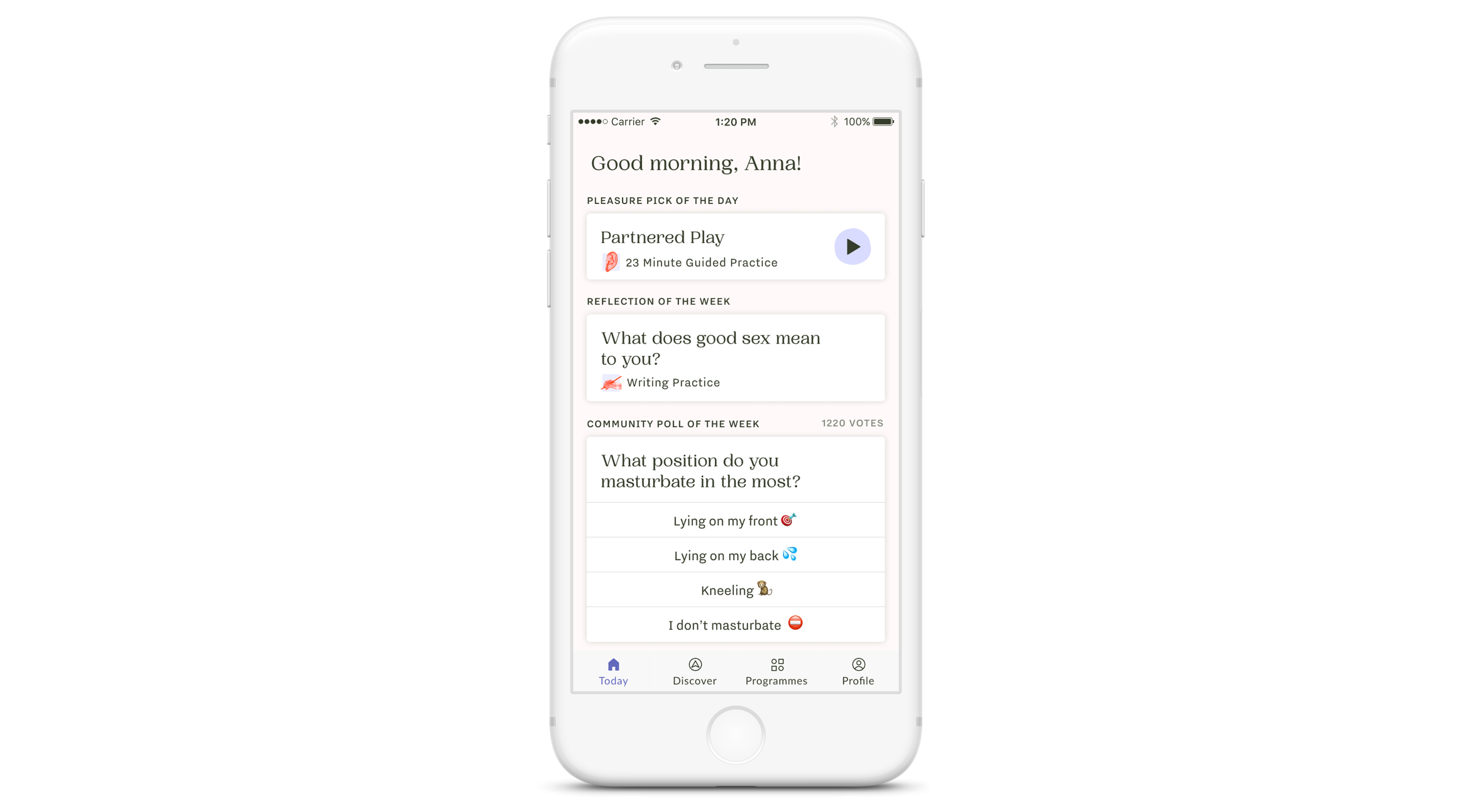
Today screen
This serves as the App’s home screen. The content on it changes daily or weekly depending on the type of content. The four main elements of the Today screen are:
Pleasure Pick of the Day
A hand picked audio session that alleviates the cognitive load when choosing content. Changes daily and can be any type of audio format (e.g. a sensual story, guided masturbation or food for thought).
Reflection of the Week
During Beta we trialled post session interactions, which helped prompt users to reflect on their relationship with their own sexuality and reinforce learnings. However, we noticed that most users didn’t actually get to do them because they were only triggered when a user listened to 100% of the audio. I therefore decided to introduce ‘Reflections of the Week’ which are journaling prompts that can be completed at any point and saved into the user profile.
Community Poll
Having access to the Ferly community via the App was a recurring theme throughout user testing. In the very first version of the App we decided to address this via a weekly community poll. Every week we’d have a different question related to sexuality, pleasure and intimacy and users could see what others have answered. The aim was also to normalise the conversation and normalising talking about sex.
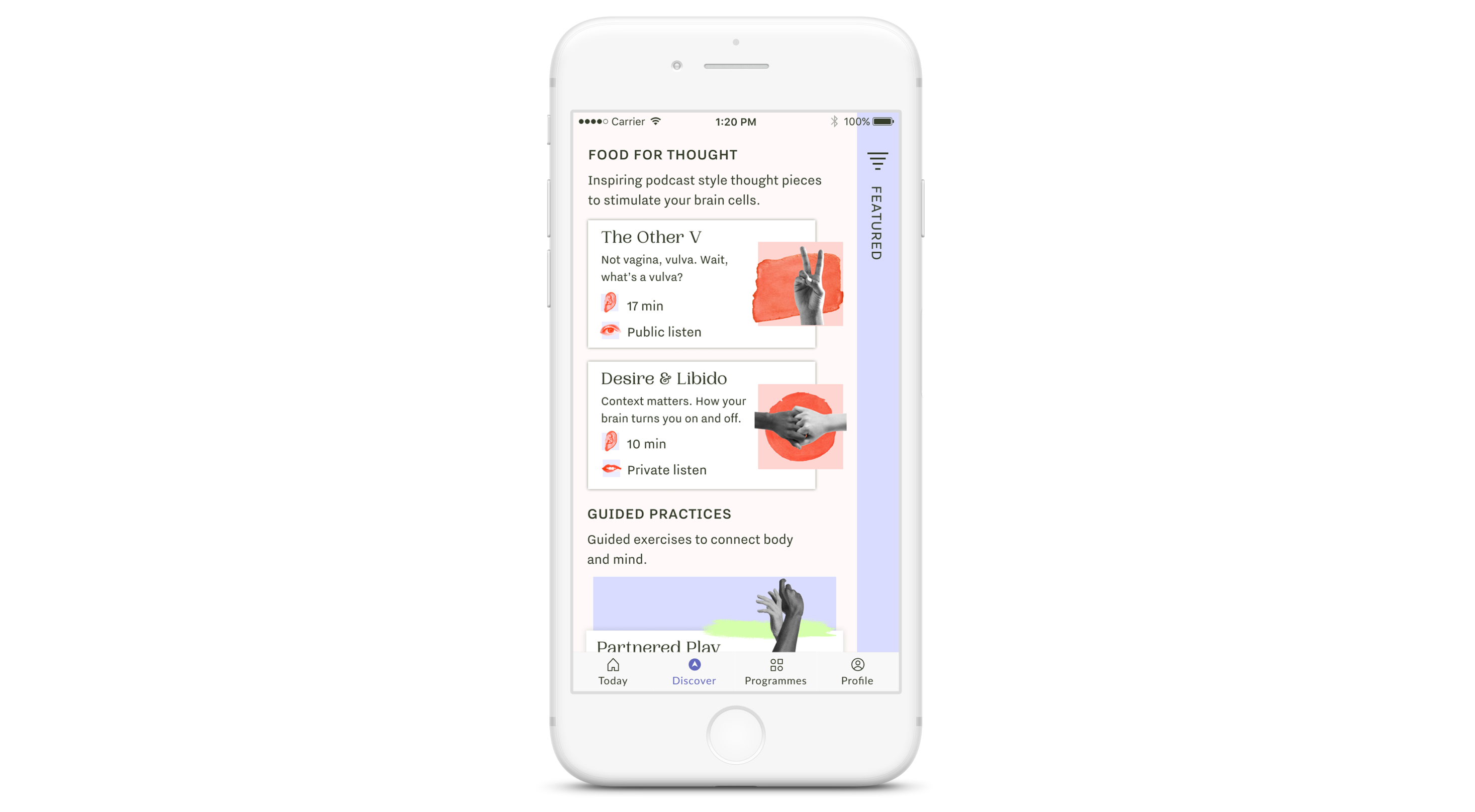
Discovery screen
During the testing phase, I noticed that users found it challenging to select content that they considered interesting or relevant to their needs. I observed a content browsing behaviour similar to ‘channel flicking’ on a tv. In order to alleviate this behaviour we decided to test different types of content filters. We decided to not implement a search functionality because the amount of content we had to date was very limited. We therefore focused on finding a way to filter the content.
I did a series of user interviews and it became evident that there are multiple factors that come into play when choosing content: Time of day, context and/or environment, emotional and mental state, acute pain-point/problem that needs solving. Underpinning this were two different motivations to come into the App: “I am curious and want to explore - help me find something that matches my mood.” and “I have a specific problem that I would like to work on.” Based on these two motivations I firstly split out the pain/problem specific programmes content into a separate programme section (see below) and focussed on organising the individual sessions in the Discovery screen. After a few co-creation sessions with users we settled on seven different context filters ranging from ‘Commuting’ to ‘In my Bed’. In addition to that I categorised the content in ‘Food for Thought’ (podcast style sex education), ‘Guided Practice’ (sensual meditations and guided touch sessions) and ‘Sensual Story’ (audio fantasies and storytelling) and added a brief description to each of the content types.
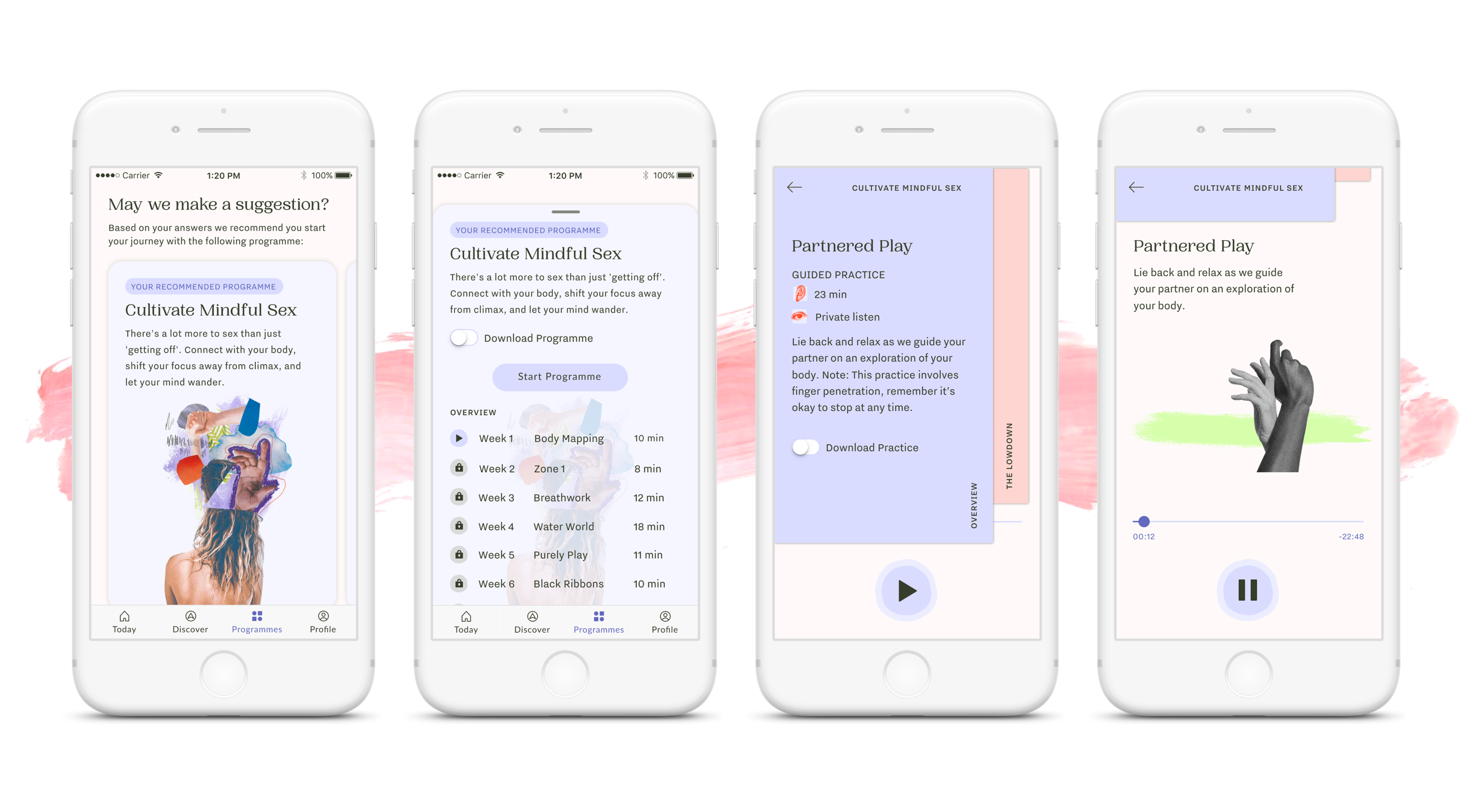
Programmes screen
This section caters to users that come into the App looking for a solution to address a specific pain point or problem. We based our selection of programmes on the most often requested topics or questions asked when we held user testing sessions or community events. These programmes addressed common topics like body confidence, improving communication, cultivating desire, alleviate over-thinking during sex or simply reconnecting with their own pleasure. Users could enroll in multiple programmes and unlock their sessions week by week.
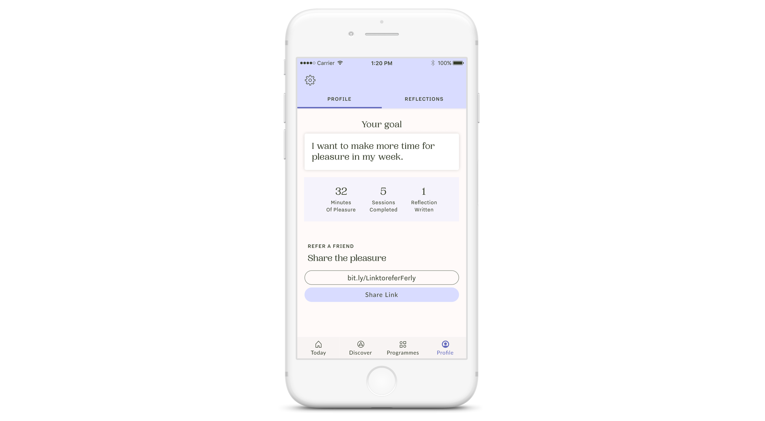
Profile screen
We decided to keep the profile screen fairly minimal to start with after receiving feedback during Beta that the way we displayed progress was too confusing. In addition to that I had multiple conversation with womxn that had concerns around tracking their ‘progress’ when it came to their own sexuality as it is an intimate and personal journey which is hard to quantify and Ferly certainly doesn’t want to be an App that sets a standard when pleasure is so multi facetted and looks different for everybody. This fact proved as one of our biggest challenges. Eventually I settled on tracking the minutes users would spend on their pleasure (measured by the minutes they listened to content on the Ferly App) until we had figured out a more sophisticated way to track individual progress. It also served as a storing place for written reflections and the App’s settings.
App Store Launch
We launched the Ferly App on the UK App Store in June 2019 and had overwhelmingly positive feedback. Shortly after the UK launch we decided to make the App available internationally.
After a month on the App Store and hundreds of downloads we could observe some behaviour patterns and trends. Users were coming into the App but only very irregularly or not as often as we’d hoped. Enrolment into programmes was relatively low and we still had a channel flicking issue. We wanted users to create a habit around using Ferly much like a meditation habit but the data showed us that most users weren’t using Ferly enough to call their use habitual.
Design challenges & solutions
We made the deliberate choice to not focus on push notifications because we wanted Ferly to be a calm App experience that allows users the autonomy to choose to use it whenever they feel like it. However, after interviewing women using the Ferly App we discovered that the majority of them would like the ability to remind themselves to make time for their pleasure. So our next feature release contained a reminder setting functionality through push notifications. This in turn, showed an uptick in repeated use of the App.
The channel flicking issue persisted so I dedicated my user research to getting to the root of this issue. After running a few interviews and surveys I noticed that a lot of women weren’t necessarily struggling with navigating to the content they want but that they were expecting Ferly to be more personalised and recommend them content that we think is relevant to them based on their listening habits. This makes a lot of sense as most users are used to Apps like Spotify and Netflix that have incredibly sophisticated recommendation algorithms at play. As a start up and product development team of effectively two people we didn’t have the resources to create an algorithm so we decided to solve the problem in a different way. See how we solved the problem in my Onboarding case study.
Summary
Sexual self care is a relatively new concept. The market has been educated by Calm and Headspace on the importance of mindfulness and the use of audio guided practices, but the connection to sexual pleasure and intimacy is relatively novel to most. While meditation and the practice of mindfulness have become corner stones of a life well lived for a lot of people –the incorporation of sexual pleasure within this is yet to happen. For Ferly to be able to achieve this it is necessary to communicate this idea effectively through an intuitive product that is sensual and educative at the same time. It needs to meet users where they are at in their own personal journey while also giving them a sense of autonomy and control over their experience.
Selected Projects

FerlyUX/UI Design, Design Research, Branding, Illustration
Moody MonthUX Design, Design Research, UX Strategy

CoconutUX/UI Design, User Research, Illustration
Not ApplicablePodcast

I AgreePoster Design, Information Graphic

SuperHiUX/UI Design
Schwarze Hunde & Bunte SchafeEditorial Design, Book Design, Storytelling, Writing