Coconut
→ Website
Year: 2017
Role: UX/UI Designer Contract
Team: Chief Product Officer, Chief Technical Officer
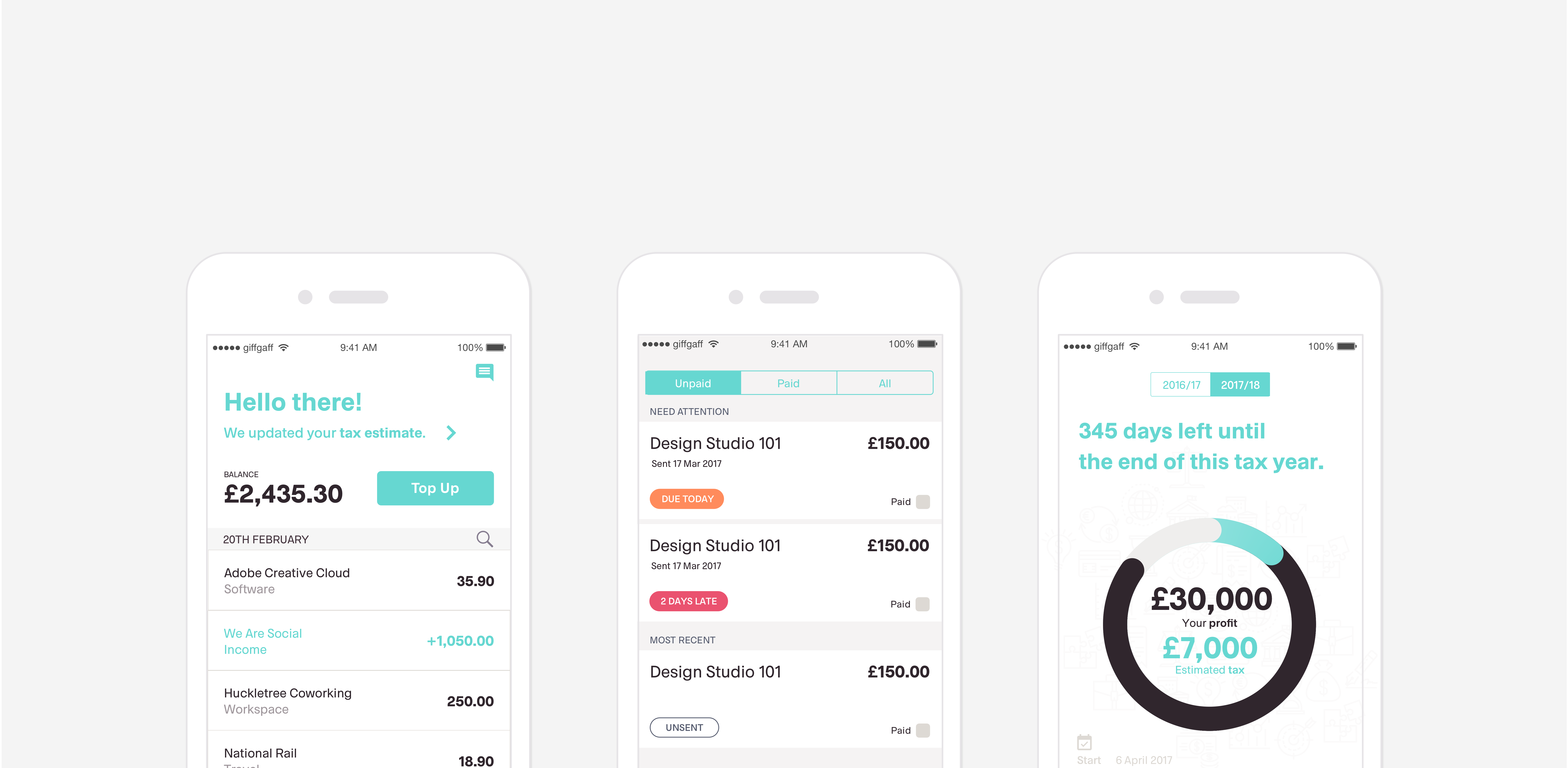
Coconut is a bank account specifically for freelancers. Founded by Adam Goodall and Samuel O’Connor in 2016 after having experienced the hassle of money management and tax returns for the self employed first hand. Being freelancers themselves they realised quickly that the 'big banks' aren't doing enough to support small companies and freelancers. Coconut wants to change that. Their mobile app is connected to a bank card which gives you a real time update on how much you owe HMRC for tax as well as automatically categorises your business expenses.
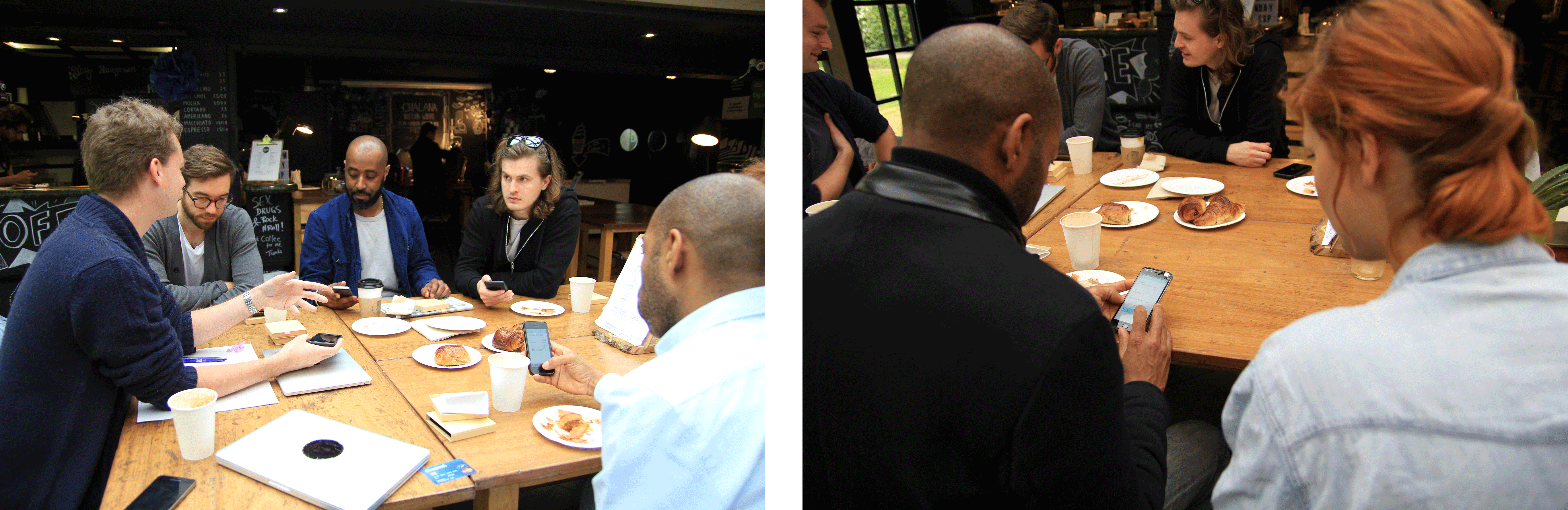
Together with Adam Goodall, co-founder and Chief of Product I carried out user research, which included extensive interviews and focus groups with freelancers, persona profiles, user stories and flows. I established a habit of continuous research by actively involving our early adopters in the design iteration process. I also prioritised, designed, tested and implemented new features and shaped the core functionality and vision of the product. This case study shows the process of how we got from a 'bare minimum' App (or MVP if you'd like) to the release of the beta version in Testflight.
Discovery Stage
A working App already existed, but only a handful of users, which were friends of Coconut had it installed and weren’t actually using it. Therefore I managed to get a couple of user interviews set up with actual freelancers. Since Coconut was based in the Mass Challenge Co working space, we were lucky to get a handful of very interested freelancers to test the app and answer us a few questions about how they were managing their business finances at the moment. The key takeaways from this were:
"Taxes are stressful and complicated." → Fear & Stress
"Good accountants are expensive and hard to find." → Cost vs. Service
"I'm worried I'll get a fine if I make a mistake." → Peace of mind
"I find it hard to keep on top of my finances." → Effort
Define Stage
Which features are essential to a functional product and which can wait until later? The idea was to meet the minimum expectations for the Coconut App to be loved by our early adopter audience. The first version of the App that we opened up to only a select few of our beta users was very limited in functionality. It was connected to a pre paid card but not a bank account. We had to make sure we don’t make promises we couldn’t keep and decided to onboard users face to face by inviting them for a coffee. That way we could answer questions about the app functionality and put emphasis on the co-creation aspect of the product.
Design Stage
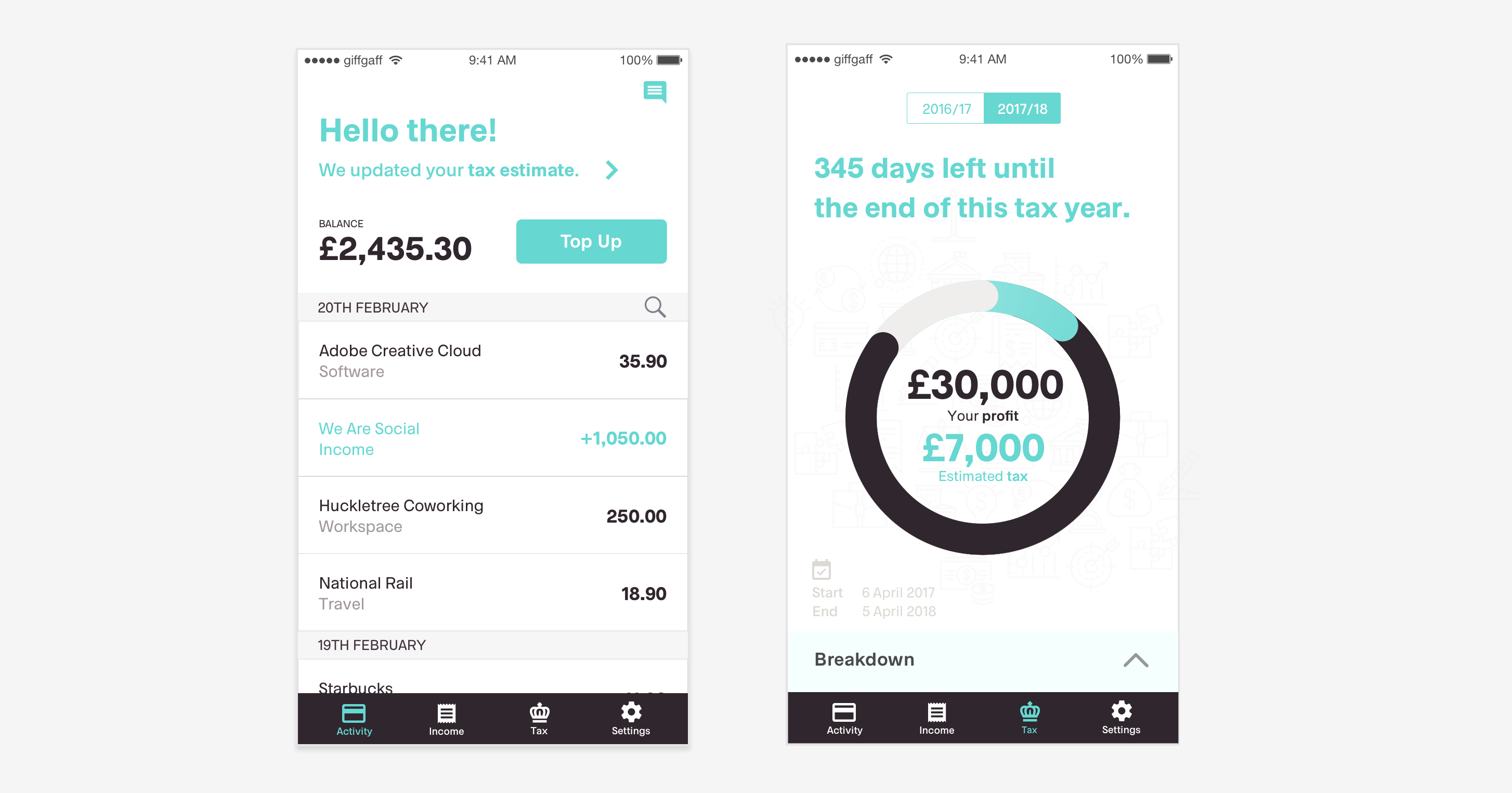
The tabbar was one of the elements that required a whole lot of testing rounds. The first version had four different tabs that were based on the limited functionality of the App: Home, Transactions, Income and Support. Since Home was basically a ‘view only’ screen where users could only check their balance and ‘tax owed’ amount we decided to merge it with the transactions screen. After another round of user testing and the fact that understanding your taxes was one of the core features of the App we decided to assign it its own tab. Another version that we tested and ditched with users was a tabbar with an action button in the middle - a secondary menu that would house three main actions: Add a transaction, photograph a receipt or pay someone. We quickly discovered that this route wasn’t leading us anywhere though. Eventually we settled on four slightly different tabs: Activity, Invoices, Tax and Settings.
'Why would I trust you?'
This question came up very often during user interviews. And it’s a valid question. How can you build trust with your users when your product hasn’t officially launched yet and you know that there are still flaws in the system. This is were the personal relationship with our early users comes in. We always met up with them face to face, handed them the cards and reassured that if anything ever happens we’re here. Of course this process only works on a small scale and the problematic nature of trust/security and control around the topic of finances will grow into an even bigger challenge once the product has been shipped.
Tone of voice
Together with Creative Director Jon Burrow, we came up with the concept of a 'personal assistant' within the App that keeps you posted on your financial health. In the first iteration this is implemented in the top section of the activity screen. We keep the user informed via short, concise messages and notifications when action is required. The tone of voice is friendly but trustworthy and the messages can be personalised to each user.
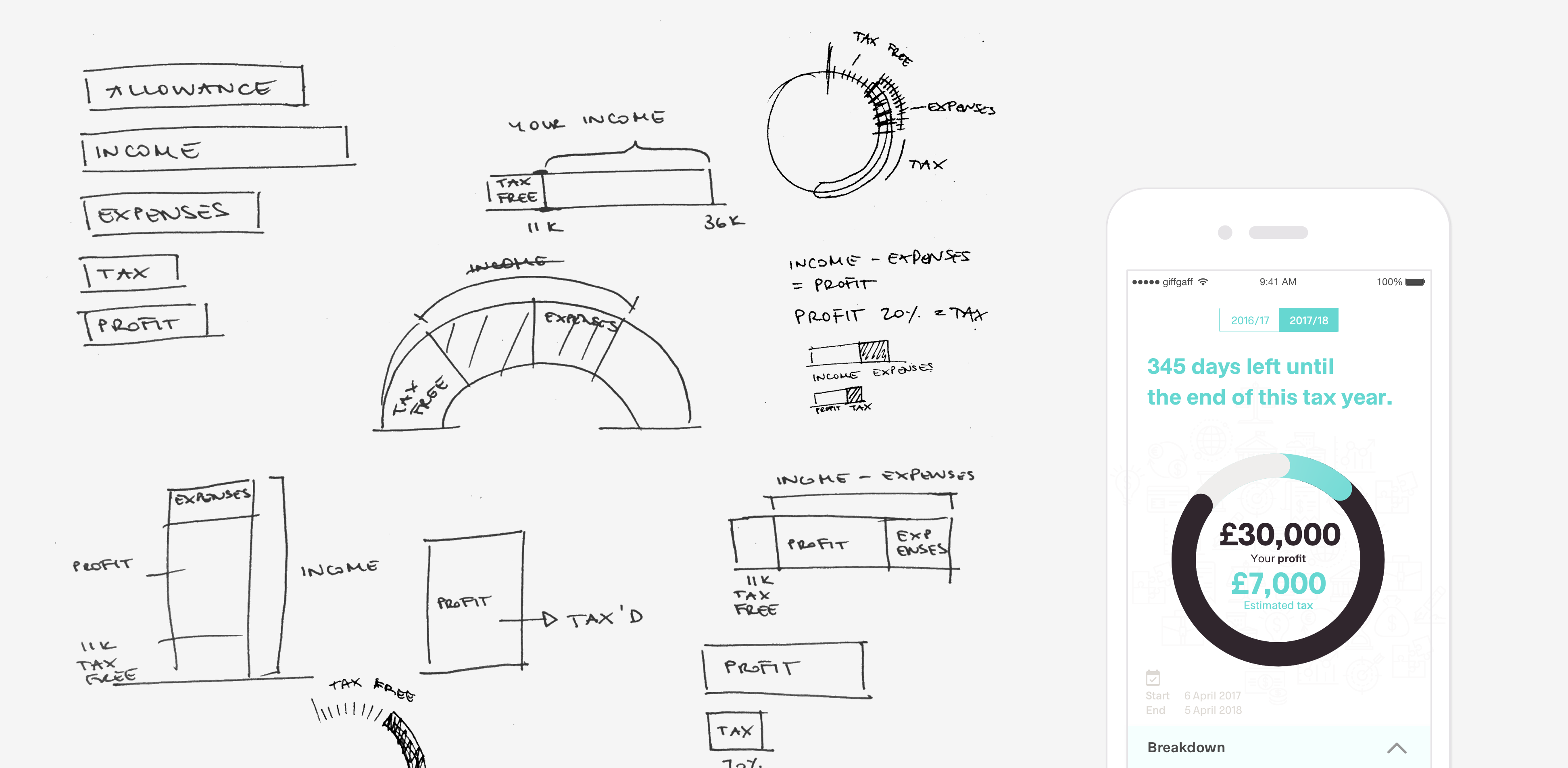
How do you explain taxes in an App?
Taxes aren’t easy to understand and there are a lot of factors that come into play when calculating them. We tried and tested a variety of designs and infographics and either overwhelmed users with too much or made them doubt the accuracy of the numbers by giving too little information.
Can I send invoices with this?
Invoicing was a feature that has been requested frequently by our users. We were a bit hesitant when it came to actually implementing it though. Users said that they would like to have this feature in the App, but observing their actual behaviour showed us that they much preferred creating and sending invoices on their laptops - not their phones. We found a solution that offered invoice creation on the go, but users would send the invoice as a PDF to themselves first so they could later on send it via email to their client.
↘︎ Invoice creation user flow
Ideation Stage
Expenses categories
The Coconut app automatically assigns every transaction to a category that corresponds with HMRC. This category can be changed by users manually in the transaction detail screen in case we got it wrong. We had feedback from users that they find the categories provided by HMRC very vague and confusing. Most of them where unsure how to categorize their expenses properly. We decided to rename the categories based on the results we got from several card sorting tests. The problem was that we simplified the categories within the app but users would still have to submit their expenses to HMRC based on their categories. This caused confusion all over again. Eventually we decided to go with HMRC's categories and provide more additional information on the categories itself within the app.
The simpler the better
Another challenge was finding the balance between providing enough information so users can get to grips with taxes and how they work and total information overload. We started with boiling it down to the essentials and a very minimalistic design but very soon discovered that sometimes less isn't necessarily more. For example in the tax screen we decided to not mention the personal allowance threshhold. This resulted in users questioning the accuracy of the tax calculation since they couldn't work out if we have factored it in or not. We discovered that we need to give users the option to get additional information if they want to. This need for transparency builds trust and gives users peace of mind.
One size fits all
Freelancers ≠ freelancers. There are a lot of different types of freelancers out there. And while they are treated similarly by HMRC they each have different needs and struggles. Someone registered as a Sole Trader has to think about their finances in a different way than someone who is registered as a Limited Company. Very often we had users come to us that would do freelance only on the side or had just transitioned from being a Sole Trader to a Ltd. Company. We decided that we would have to have two different versions of the mobile App. One fore Sole Traders and one for Limited Companies. This would have to be determined by the information the user entered during the Sign Up and Onboarding process of the App. Currently this happens via a Typeform when they apply for early access on the Coconut website.
↘︎ Design iteration of the transaction detail screen
Key Learnings
Knowing our users
The most important part for every consumer facing project is the user research. By ‘manually’ onboarding new users to Coconut we minimised money and resources spent on designing an Onboarding flow and could connect with users on a much more personal level. We set up forth weekly meet ups including free coffee or beers and pizza on us. This resulted in users being way more engaged and us constantly receiving their valuable feedback via email or directly through the Intercom chat in the App.
Engaging a community
Coconut has recently set up a private Facebook group for Freelancers and people who are interested in Coconut. This group functions as a platform for freelancers to connect and talk about (not only) money and finance related subjects. On the first day of launching the group we achieved 150 Freelancers joining, all of which are very engaged and provide a lot of valuable feedback about what they expect Coconut to be or stories about what they are struggling with at the moment. Some users are even exchanging tipps and tricks on how they currently manage their money or deal with clients etc.
Summary
The product is still at a very early stage. But we have received enough feedback from our beta testers and stakeholders to build upon and iterate on the next version. One of the most important tasks during the next iteration phase will be adding an actual Sign Up and Onboarding process. This is a very challenging task as it has to be quick and simple as well as provide us with enough detailed user information so we can set up and personalise the App for each users' needs.
Another big feature that will be implemented in the near future is the support for Limited Companies. At the moment it is tailored to the needs of Sole Traders.
The App is currently only on Testflight and in closed Beta. It will be available on the App Store later this year. But if you're curious about what Coconut is currently up to or want to join their vibrant community of freelancers, go check them out at: www.getcoconut.com
Selected Projects

FerlyUX/UI Design, Design Research, Branding, Illustration
Moody MonthUX Design, Design Research, UX Strategy
CoconutUX/UI Design, User Research, Illustration
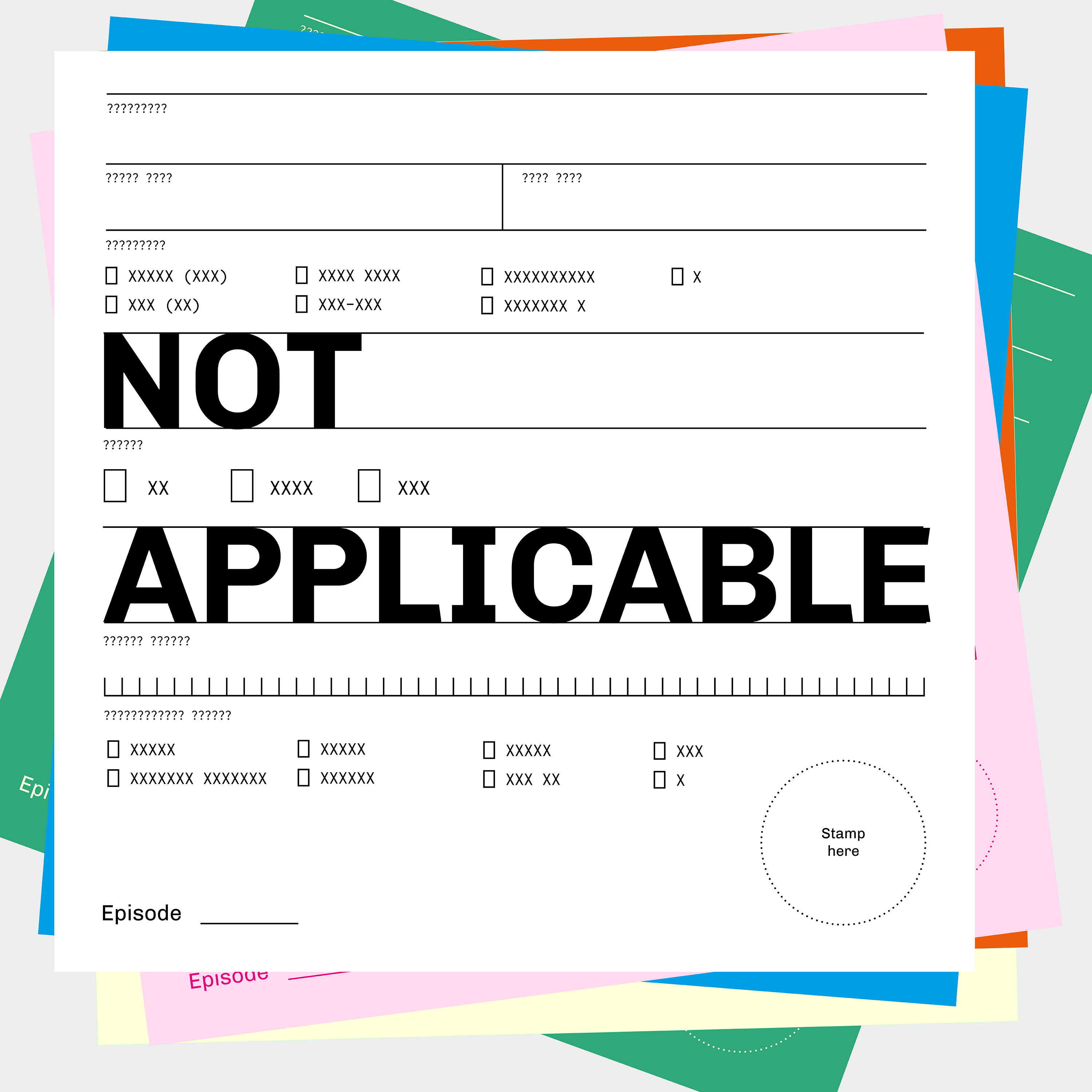
Not ApplicablePodcast

I AgreePoster Design, Information Graphic

SuperHiUX/UI Design
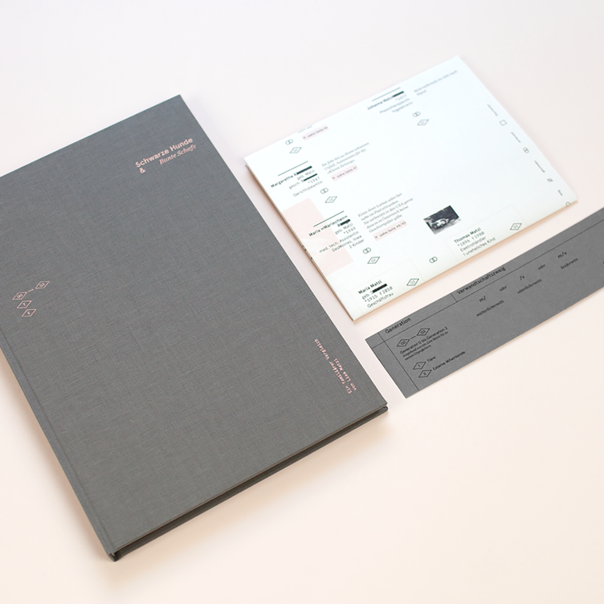
Schwarze Hunde & Bunte SchafeEditorial Design, Book Design, Storytelling, Writing